I’m not too happy to spend time pointing out flaws in AI slop. That kind of bullshit asymmetry feels a bit too much like work. But, since you’re polite about it, and seem to ask in good faith…
First of all this is presented as a technical infographic on an “algorithm” for how a recommendation engine will work. As someone whose job it is to design similar things, it explains pretty much nothing of substance. It does, however, include many concepts that would be part of something like this, with fuzzy boxes and arrow that make very little sense. With some minor trivial parts you can assume from the problem description itself. It’s all just weird and confusing. And, “confusing” not in the “skill issue” sense.
So let’s see what this suggested algorithm is.
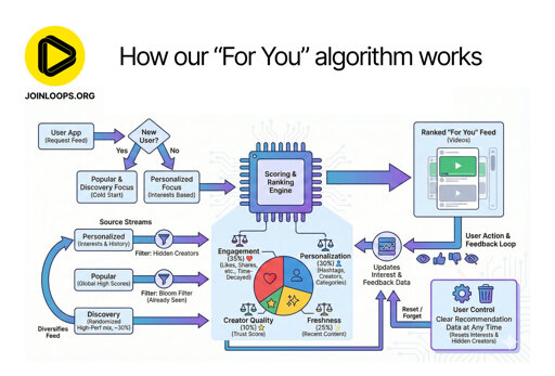
It starts out with “user requests the feed”, and depending on whether or not you have “preference” data (prior interests or choices, etc), you give either a selection based on something generic, or something that you can base recommendations on. Well… sure. So far, silly, and trivial.
“Scoring and ranking engine”. And below this, a pie diagram with four categories. Why are there lines between only the two top categories, and the engine box? Seems weird, but, OK. I suppose all four are equally connected, which would be clearer without the lines. Also, what are the ratios here? Weights for importance, of some sort? “Time-Decayed”? I hope that’s not the term that stuck for measuring retention/attention time.
On the three horizontal “Source Streams” arrows coming in from the left, its all just weird. The source streams are going to be… generated content, no? But let’s give it the befit of the doubt and assume it’s suggesting that, given generated content, some of it might can be considered relevant for “personal preference” and has a “filter: hidden creators”, but, none of that makes any sense. The scoring and ranking engine is already suggested to do this part… The next one is “Popular (high scores) filter: bloom filter (already seen)”. Which mixes concepts. A bloom filter is the perfect thing to confuse an LLM, because it has nothing to do with filters in the exact same context “filters” was used for the above source stream. Something intelligent wouldn’t make this mistake. But, it does statistically parrot it’s way to suggest that a bloom filter might have something to do with a cost effective predicate function that could make sense for a “has seen before”. However, why is this here?
I’ll just leave it at that. This infographic would make a lot of sense if it was created by some high schoolers who were tasked to do something like this. Came up with some relevant sounding concepts. Didn’t fully understand any of them. Which is also exactly the kind of stuff LLMs do
I don’t think loops hired a bunch of kids, so LLM it is.
And the like “Our new For You algorithm is pretty complex, so we created this infographic to make it easier to understand!”, doesn’t help the case against LLM either. There a many complex parts of a recommendation engine, but none of the things in this infographic explain or illuminate those complex parts…
But, I might be wrong, and this is their earnest attempt at explaining how their algorithm works. In which case, they are just bad at either explaining it, or at designing it, most likely both. Then again, if I’m right, and this is generated by an LLM still gives the same impression, but leaves some room for “someone who isn’t technical, asked an LLM, and phoned this in because it looked cool, and people who don’t know any better will think so too!”
Just because you overanalyzed something to the point of confusing yourself does not mean that it is AI slop, or equally confusing for others.
To address the specific points you raised as “evidence” of AI:
The two top categories have lines going to them because those are the things that a user controls with their activity on the platform. Prior to that, the “for you” recommendation engine is not active, since it has nothing to base it’s recommendations on. Seems pretty clear to me.
Time decayed, in the context of that category means when you last interacted with a post. If you haven’t interacted with a post for a while, it will no longer show up in your for you feed. Again, really quite straight forward.
What about filtering hidden creators makes no sense? You hide a creator, they don’t show up in your feed. That’s one aspect of personalization, from the start, the rest of it is the two categories that, once they make it past the “hidden creator” filter, determine how likely it is to show up.
Bloom filter is literally explained right there, it’s if you have seen a post yet or not. Lemmy clearly does not have this sort of filter, because you keep seeing the same shit over and over until it drops off from whatever category of the feed you’re viewing. Really not sure what is hard to understand there.
You’re using a lot of fancy words in your analysis here, but the actual analysis is nonsensical. Almost makes me wonder if you yourself are actually a bot.
probably because the block under the cpu looking thing doesn’t indicate how it interacts with the cpu looking block and the block that ranking engine feeds into the ranked “for you” feed also there’s two user controls
It seems that the pie chart under the cpu describes the weights of video characteristics that push to the top of your algorithm. But that’s a guess, and it should be clearer than that if the platform wants to be transparent.


This infographic reeks of AI slop.
What about it?
I’m not too happy to spend time pointing out flaws in AI slop. That kind of bullshit asymmetry feels a bit too much like work. But, since you’re polite about it, and seem to ask in good faith…
First of all this is presented as a technical infographic on an “algorithm” for how a recommendation engine will work. As someone whose job it is to design similar things, it explains pretty much nothing of substance. It does, however, include many concepts that would be part of something like this, with fuzzy boxes and arrow that make very little sense. With some minor trivial parts you can assume from the problem description itself. It’s all just weird and confusing. And, “confusing” not in the “skill issue” sense.
So let’s see what this suggested algorithm is.
It starts out with “user requests the feed”, and depending on whether or not you have “preference” data (prior interests or choices, etc), you give either a selection based on something generic, or something that you can base recommendations on. Well… sure. So far, silly, and trivial.
“Scoring and ranking engine”. And below this, a pie diagram with four categories. Why are there lines between only the two top categories, and the engine box? Seems weird, but, OK. I suppose all four are equally connected, which would be clearer without the lines. Also, what are the ratios here? Weights for importance, of some sort? “Time-Decayed”? I hope that’s not the term that stuck for measuring retention/attention time.
On the three horizontal “Source Streams” arrows coming in from the left, its all just weird. The source streams are going to be… generated content, no? But let’s give it the befit of the doubt and assume it’s suggesting that, given generated content, some of it might can be considered relevant for “personal preference” and has a “filter: hidden creators”, but, none of that makes any sense. The scoring and ranking engine is already suggested to do this part… The next one is “Popular (high scores) filter: bloom filter (already seen)”. Which mixes concepts. A bloom filter is the perfect thing to confuse an LLM, because it has nothing to do with filters in the exact same context “filters” was used for the above source stream. Something intelligent wouldn’t make this mistake. But, it does statistically parrot it’s way to suggest that a bloom filter might have something to do with a cost effective predicate function that could make sense for a “has seen before”. However, why is this here?
I’ll just leave it at that. This infographic would make a lot of sense if it was created by some high schoolers who were tasked to do something like this. Came up with some relevant sounding concepts. Didn’t fully understand any of them. Which is also exactly the kind of stuff LLMs do
I don’t think loops hired a bunch of kids, so LLM it is.
And the like “Our new For You algorithm is pretty complex, so we created this infographic to make it easier to understand!”, doesn’t help the case against LLM either. There a many complex parts of a recommendation engine, but none of the things in this infographic explain or illuminate those complex parts…
But, I might be wrong, and this is their earnest attempt at explaining how their algorithm works. In which case, they are just bad at either explaining it, or at designing it, most likely both. Then again, if I’m right, and this is generated by an LLM still gives the same impression, but leaves some room for “someone who isn’t technical, asked an LLM, and phoned this in because it looked cool, and people who don’t know any better will think so too!”
Just because you overanalyzed something to the point of confusing yourself does not mean that it is AI slop, or equally confusing for others.
To address the specific points you raised as “evidence” of AI:
You’re using a lot of fancy words in your analysis here, but the actual analysis is nonsensical. Almost makes me wonder if you yourself are actually a bot.
probably because the block under the cpu looking thing doesn’t indicate how it interacts with the cpu looking block and the block that ranking engine feeds into the ranked “for you” feed also there’s two user controls
It seems that the pie chart under the cpu describes the weights of video characteristics that push to the top of your algorithm. But that’s a guess, and it should be clearer than that if the platform wants to be transparent.
“Everything I don’t like is AI”
That’s way too reductive.